How the Wrong Color Made a Room Feel Smaller
Choosing the best color for small houses is a bit more complicated than “light color = bigger space, dark color = smaller space.” In fact, you could go with light shades and still end up with a cramped room with no personality.
Today, we’ve explained how color psychology molds the way we perceive space, and how you can use it to your advantage. Scroll to discover common color mistakes, correct combinations, and timeless monochrome options.
What Is the Impact of Color on Room Size Perception?
The color of a room has a direct psychological effect on our visual perceptions; colors with different reflections, temperatures, and contrasts either enhance or reduce dimensions.
When choosing the best color for a small house, remember how colors and light interact so you can easily manipulate rooms to appear larger or more intimate:
- Light reflectance value (LRV): Colors with higher LRV, like whites or pastels, reflect more light. They make rooms open and airy. On the other hand, low LRV colors, AKA dark tones, absorb light and visually shrink the place. (For a deeper dive, visit The Land of Color)
- Warm vs. cool tones: Warm shades (reds, yellows, oranges) tend to advance visually. They’re rich, bold, and create a cozier yet more enclosed space. Cool hues (blues, greens, purples) behave differently. They recede and bring visual depth to the room.
- Contrast and visual boundaries: High contrast between walls and furniture leads to visual boundaries and distinct zones. With low-contrast colors (similar tones for walls, trim, furniture), you’ll have a smooth flow that makes the room feel bigger and more cohesive.
Common Color Mistakes That Make Small Rooms Feel Smaller
Compact spaces, like those in Toronto condos and older homes, easily feel more cramped with the wrong color choices, such as:
- Dark walls with low natural light: One of the common small room color mistakes is trying to pair deep tones with limited natural light. Dark tones are cozy, but they capture the light, which makes the area feel even more confined and dim.
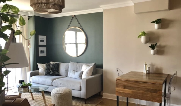
- High-contrast trims: Bold, contrasting trims on lighter walls may seem stylish, though they often break the flow of the room, leading to a more segmented and even less expansive look.
- Overuse of accent walls: Accent walls are great for making a statement (even in limited scopes) when placed strategically. Using them excessively in a small space creates a visual divide and makes the place feel cluttered rather than open.
- Ignoring ceiling color: Dark ceilings pull the walls inward. Lighter shades help visually raise the height and stretch the room.
- Too many bold colors: One deep tone may be inviting and sophisticated. But a mix of strong hues feels more chaotic and reduces spaciousness. To avoid small room color mistakes, go for a more harmonious and/or soft palette to have a relaxed, roomy atmosphere.
Best Color Combinations for Small Houses
If you want to find the best color combination for a small house, don’t focus on trends. Look for timeless pairs for a sense of openness without overwhelming the space.
Depending on your personal taste, this could mean harmonizing tones or consistent contrasts. Let’s review a few examples that ensure a cohesive as well as spacious feel:
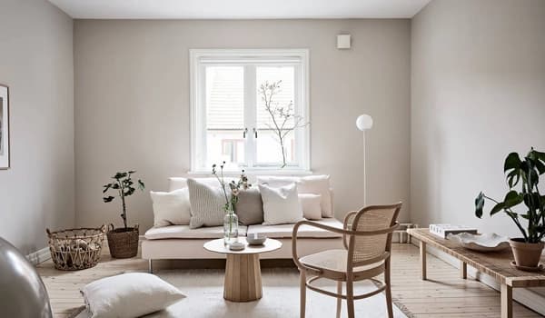
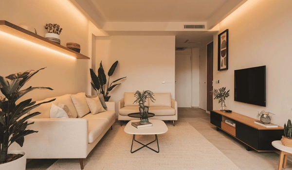
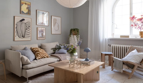
- Soft neutral walls + white ceilings: Neutral walls bounce the light right back, while white ceilings lift the space and give the illusion of height. This combination is perfect for tranquil moods, while making modest areas feel bigger. (Example: Light beige walls with a crisp white ceiling)
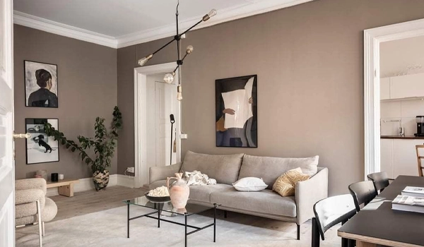
- Monochromatic palettes: Varying shades of the same color is a classic, always-practical choice. They keep the visual flow uncluttered and give an expansive feel to the room by reducing sharp contrasts and visual disruptions. (Example: Light gray walls, medium gray furniture, dark gray accents)
- Light greige + warm white trim: The subtle, neutral greige pairs well with warm white trim. It reflects enough light to keep the space open, while the trims add brightness without being too harsh. This is the best color combination for a small house, especially for a refined and cozy aesthetic.
- Muted pastels with consistent undertones: Looking for a harmonious and peaceful aesthetic? This may be the one for you. Thanks to similar undertones, they won’t compete for attention and keep the focus calm. This color combo also prevents the space from feeling chaotic and hides the limited square footage beautifully. (Example: Soft lavender walls with pale pink accents)
- Light gray + soft taupe accents: Light gray provides a neutral base that reflects light, and the soft taupe accents introduce a bit of warmth without closing the environment down. Some of the best color combinations for small houses (like these two) have a subtle contrast, which offers a balanced look that still seems enlarged and serene.
Best Wall Colors for Small Homes
In order to choose the best color for a small house, it’s important to consider the unique lighting conditions and climate (on top of the vibe you’re expecting from the room, your personal style, and so on).
Toronto’s often cloudy weather means limited natural light. So, you need colors that reflect light and create warmth. Besides, a lot of homes feature older architecture, like condos or Victorian-style houses. They could use shades that complement their features while opening up tight rooms.
- Off-white and warm whites: Shades like warm ivory or soft off-white brighten rooms with limited sunlight. They have a timeless, clean look and pair well with both modern and traditional decor.
- Light gray and greige: This duo works well in Toronto homes, too, particularly in areas where the weather tends to be overcast. They bring depth without being gloomy and complement different styles, from contemporary condos to classic homes.
- Soft beige and taupe: These warm, neutral tones are incredibly versatile and suit Toronto’s brick exteriors or wooden details. As the best colors for a small house, they also soften the space and recreate a cozy, welcoming atmosphere.
- Pale blue or sage green: Both are calming, cool-toned colors that blend in Toronto's humid summers and long winters. They have ideal LRV to expand the room, as well as shape a peaceful and refreshing environment.
- Soft whites with gray undertones: A soft white with a hint of gray is a good alternative to pure white. Instead of looking bare and plain, they offer warmth and match modern finishes, such as stainless steel or glass, which are common in newer Toronto condos.
At the end of the day, choosing the best color for small houses is not simply about light vs. dark. The key is to balance colors with complementary elements like texture, warmth, and contrast to avoid a flat or crowded look. Have fun painting and decorating.


- In this post:
- What Is the Impact of Color on Room Size Perception?
- Common Color Mistakes That Make Small Rooms Feel Smaller
- Best Color Combinations for Small Houses
- Best Wall Colors for Small Homes