Matching Paint Color to Furniture: Common Errors
Ever repainted a room or bought new furniture, only to feel that something is still visually “off”? Furniture matching wall color is usually the missing link.
In this guide, we’ll explore common mistakes in this process, principles that create harmony, and practical solutions that work in your home, not just showrooms.
Why Paint and Furniture Coordination Matters
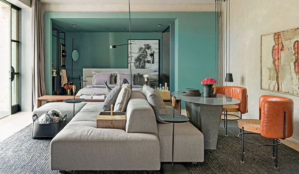
The interaction between paint and furniture plays a huge role in how a room looks and feels. Walls are often considered as the background, and furniture is the main subject. Together, they create the first visual impression, determining whether a room feels cohesive or disjointed.
When you match furniture with wall color using balanced palettes, the room feels calm and helps the eye move easily across space. With proper contrast, however, you’ll have a more energized space with defined zones.
Contrast also shapes depth and focus. Dark colors have more visual weight and draw the eye, while lighter colors tend to recede. No contrast makes the room flat or washed out, and harsh contrasts disrupt the visual perception. But balancing them adds dimension and keeps furniture from dissolving in the background.
Furniture and wall undertones impact harmony, too, because lighting changes how you see colors. Besides, mismatches become (more) recognizable in different light conditions. Imagine cool gray walls with a beige sofa that has warm undertones; looks a bit off, right?
Common Mistakes When Matching Paint Color to Furniture
Furniture matching wall color goes beyond aesthetics, and that’s where most homeowners unintentionally make costly visual mistakes.
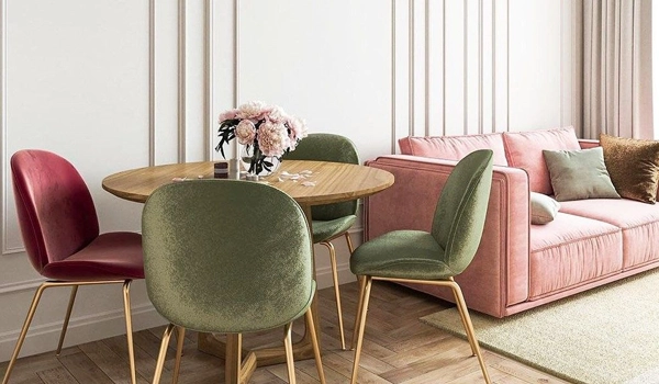
First, there’s ignoring undertones. Even similar colors (like different whites or greys) can have different undertones. If furniture and walls have opposing undertones, they’ll visually clash, making at least one of them off-toned.
Matching colors too closely is another pitfall. Identical colors for paint and furniture (like exact neutrals) melt elements into each other and minimize depth. Experts at Integrity Painting recommend choosing colors a few shades lighter/darker to create contrast as well as prevent visual blending.
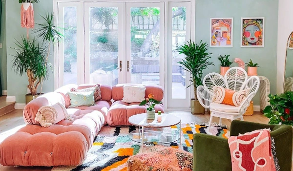
Too much contrast (like ultra-dark furniture against very light walls) without intermediate tones or textures overwhelms the eye as well. You should use brightness or darkness strategically to add focus, not disrupting the flow.
Another mistake is ignoring the lighting. Paint swatches look very different on a wall under real light compared to chips or screens. Always test colors in actual lighting so you don’t end up with a pale cool grey wall that looks greenish in north light but warm in evening light.
Additional Tip: To match furniture with wall color, it’s best to select major furnishings pieces first, then paint colors that enhance them. Furniture fabrics and finishes are limited, but paint options are essentially infinite.
How Undertones Cause Most Color Matching Problems
Undertones exist beneath the main color. They may not be obvious at first glance, but influence how colors appear in a room. Warm undertones (red, yellow, orange) give an inviting and cozy feeling to colors, while cool undertones (blue, green, violet) make them calm and crisp.
Furniture materials have their own undertone, too. For instance, leather and wood often lean warm, but brushed metal frames are cool. If the walls have cool undertones but your furniture is warm (or vice versa), they’ll work against each other, even if the main colors seem to match on a paint deck or in isolation.
Another clash in furniture matching wall color can happen when using similar shades. Because even when two colors have harmony, their undertones may pull in opposite directions, like warm grey walls (blue undertones) and beige furniture (yellow undertones).
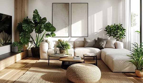
Furniture Matching Wall Color in Small vs Large Rooms
The visual interaction between wall color and furniture is more intense in small rooms. Since there’s less room for elements to breathe, too much contrast or too many bold/dark colors result in a compact and cluttered space.
However, using lighter neutrals to match furniture with wall color helps open up the room by reflecting more light and reducing visual noise. For example, pale walls paired with matching or slightly darker furniture expand the room by blurring boundaries and reducing crowding.
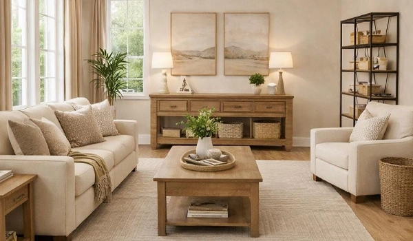
Large rooms provide more space, but there’s still the risk of feeling empty or a lack of definition. Bigger spaces make matching mistakes more pronounced, especially when paint and furniture fail to define distinct zones.
The solution lies in intentional contrast or layered schemes to create zones and give furniture visual presence and purpose. Light-neutral walls with mid-tone furniture prevent the space from looking flat or empty, too.
How Lighting Changes the Relationship Between Walls and Furniture
Natural light is always shifting: morning light is cooler and softer, making cool tones lighter and brighter; midday daylight is on the neutral side and shows a color closest to its true pigment; finally, evening light adds golden tones that deepen warm hues on walls and furniture.
Daylight direction also changes color perception. North-facing rooms get a bluish light, which can dull warm paint and mute furniture tones. In contrast, south-facing rooms get warmer, brighter light that enhances warm undertones.
Different bulbs have different color temperatures, too. Warm bulbs make warm tones richer and soften cool colors; cool bulbs make cool tones pop and dull warm tones; and daylight-balanced bulbs almost behave like natural light.
Lighting placement, shadows, and intensity play a significant role as well. That’s why the same furniture matching wall color feels crisp in bright, overhead light and cozy or washed out in dim or side-lit conditions. Keep that in mind when looking at wall paints or furniture fabrics matching perfectly in-store.
In conclusion, match furniture with wall color knowing that lighting is the final filter that decides if a pairing truly works. Test combinations in real lighting, so the final result feels intentional, balanced, and inviting.


- In this post:
- Why Paint and Furniture Coordination Matters
- Common Mistakes When Matching Paint Color to Furniture
- How Undertones Cause Most Color Matching Problems
- Furniture Matching Wall Color in Small vs Large Rooms
- How Lighting Changes the Relationship Between Walls and Furniture