Dining Room Paint Colors

Who claimed that color wasn't possible in dining rooms? This area is perfect for dinner parties and family get-togethers, making it one of the best places in the house to experiment with color saturation.
Here are the best dining room paint colors from well-known designers to help you get the ideal sophisticated look.
This selection will assist you in choosing the ideal paint color for your dining room, regardless of size, whether you want a classic or modern style to mix with light or dark furniture.
Elegant Neutrals
You'll note that whenever we talk about keeping home decor minimal, neutral hues—especially white—are utilized a lot.
Your dining area can look lighter, airier, and larger by applying these neutral white dining room paint colors on the walls, which will reflect both artificial and natural light.
Ivory
One of the best dining room paint colors is ivory. Ivory may provide a sense of refinement and relaxation to a space.
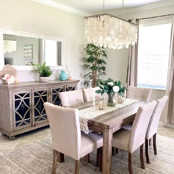
image sourced from here
Compared to white, it offers a richer, warmer vibe. Ivory goes as nicely with jewel tones as it does with teal or blue tones.
Interested in more information about ivory painting color? Click here.
Soft Gray
Gray is one of the most adaptable neutrals; it may be serene or edgy, chilly or warm, and it elevates any space, especially your dining area.
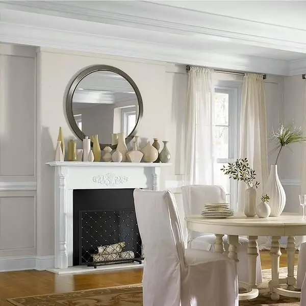
image sourced from here
If you don’t know what the best color for the dining room is, a dining area can seem modern and fresh, peaceful and soulful, or all four at once, depending on the shade of gray used.
Here you can find more gray dining room paint colors.
Warm Beige
Beige is one of the timeless dining room paints that add a subtle warmth that makes the room feel cozier, more welcoming, and more lived in than stark white does.
image sourced from here
Compared to white, beige provides a modest depth and color dimension that prevents a space from appearing cold or lifeless.
If you need more information about beige color, click here.
Traditional Whites
Traditional Whites create an open, spacious feeling in a dining area. White rooms are calming and light, but if they are not broken up with lots of texture or color, they can come across as cold or clinical.
When decorating, bear in mind that any color utilized with white will appear brighter or richer than white.
Classic White
For dining rooms, classic white is a popular color option since it gives a classic and refined appearance. It is a flexible option for any dining area because of its neutral tint, which goes well with a variety of colors and décor styles.
image sourced from here
Antique White
Combining the greatest aspects of off-white and stylish greige, Antique White is a perfect option to help you realize your ideas of a contemporary design.
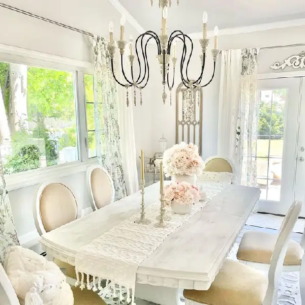
image sourced from here
If you've already chosen your trademark hue, use it as an accent color or generously apply it to breathe fresh life into the walls of your dining area.
Cream
Because it fosters a cozy and welcoming ambiance, cream hue is frequently utilized in dining rooms and it is such a warm dining room color.
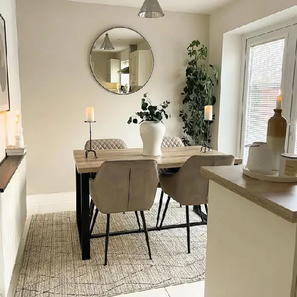
image sourced from here
Additionally, it can increase the room's perceived size and openness, which is particularly advantageous in smaller eating areas. Cream is an adaptable hue that works well with both classic and modern décor styles.
Timeless Blues
Different hues of blues are other modern dining room paint colors you can consider.
A calm, tranquil color scheme ideal for creating a cozy and restful dining area is the timeless blues color palette.
The color scheme includes a variety of blue tones, from rich and deep navy blues to light and airy sky blues.
To provide harmony and balance, neutral hues like white, gray, and beige are frequently used with these blues.
Navy Blue
When utilized in interior décor, navy blue is a classic and timeless hue that creates a refined style that will always be elegant.
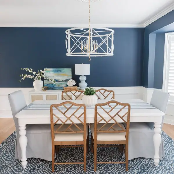
image sourced from here
Any place that uses navy blue will seem more spacious and deep, just like a midnight blue sky or the seas of a deep blue sea.
Duck Egg Blue
Due to its ability to provide a tranquil and pleasant ambiance, duck egg blue is a hue that is frequently used in dining rooms.
image sourced from here
It may also give the area a hint of class and elegance. Furthermore, duck egg blue is a color that works well with a wide range of décor types and complements a number of other hues.
Slate Blue
Dark grayish-blue slate blue is a hue that's frequently used in interior design to provide a peaceful and tranquil ambiance.
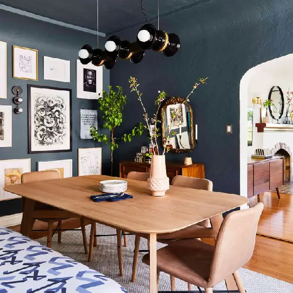
image sourced from here
It is a color that goes well with many different hues, such as beige, brown, white, and gray. Another common color for accent walls is slate blue, which gives a space a hint of refinement and drama.
Rich Earth Tones
Any place may seem warm and inviting by using earthy tones, and choosing a paint color that draws inspiration from nature can instantly make a space feel cozy.
Choosing color palettes that evoke the outdoors, such as cold grays and beiges or rich reds and tans, creates a calming atmosphere in your house.
Deep Burgundy
Rich, dark reds like deep burgundy have been utilized for generations to provide interior spaces coziness and grace.
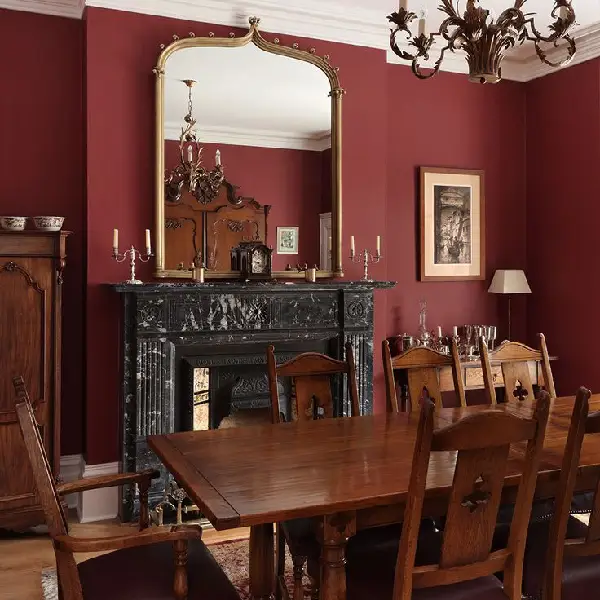
image sourced from here
Deep burgundy may create a chic and welcoming ambiance in the dining area that is ideal for hosting visitors.
Olive Green
Olive greens have all the biophilic qualities of other greens, with the extra bonus of looking effortlessly put together and stylish.
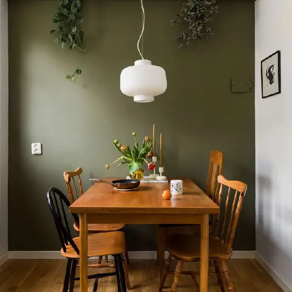
image sourced from here
Living rooms and dining rooms may have their design credentials enhanced with a subtle shade of olive paint. In the meantime, a modern kitchen will look much better with a deeper shade of olive paint.
Chocolate Brown
Chocolate brown is a natural, neutral hue that stands for purity, healing, stability, honesty, and anchoring.
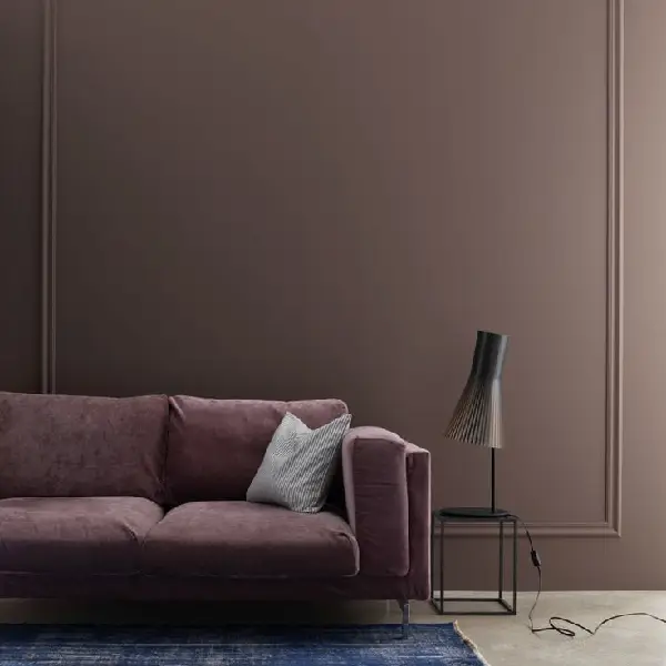
image sourced from here
It is associated with development and nurturing and is the hue of wood and soil. Since chocolate brown is frequently connected to the fall and winter seasons, this is the ideal moment to introduce it inside.
Classic Greens
Your home's separate dining area may frequently feel claustrophobic and little. Using open-concept green paint is one approach to get around this.
Similarly, if your house has more of an open floor plan, you should choose paint that highlights the room's features and makes it feel spacious and bright.
Sage Green
Sage green is a stunning and adaptable hue that can be utilized in many different ways to design a chic and cozy eating area.
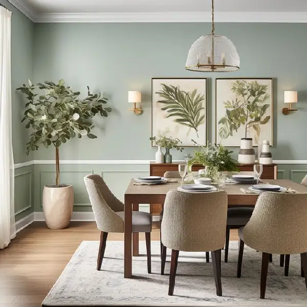
image sourced from here
Because sage green is such a versatile color, it can be combined with many other hues to create a range of appearances and styles.
Moss Green
When utilized, moss green is a rich, vivid earthy tone that gives your house depth and foundation. This tint may be used in so many various ways, from the most understated to the most extravagant.
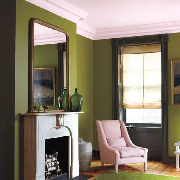
image sourced from here
Forest Green
Forest green may be utilized to produce a number of various appearances in the dining room.
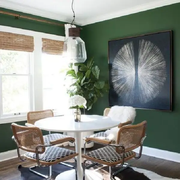
image sourced from here
Combine forest green with cream-colored walls and dark wood furnishings for a classic style.
Timeless Greige
The color greige is a popular option for dining rooms because of its classic charm and adaptability.
It offers a backdrop that is neutral enough to go with a variety of décor types and makes coordinating accent colors simple.
Greige
Warmer greige is often used in lesser light settings to help create a cozier atmosphere. Meanwhile, a cooler greige can maintain the sensation of lightness and airiness in an area with lots of natural light.
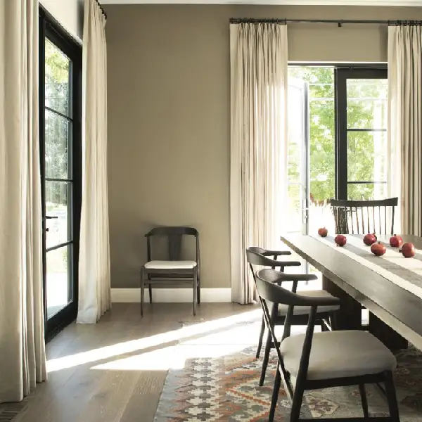
image sourced from here
Taupe
A dark taupe provides a sense of closeness and shrinks a huge area, whereas a light taupe will brighten and expand tiny, gloomy spaces.
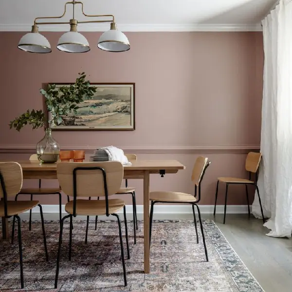
image sourced from here
Because north-facing rooms receive less sunlight and are generally colder and darker, taupe with a hint of warmth will add a pleasant glow to your walls.
Muted Pastels
For dining rooms, muted pastels are a popular option because they provide a cozy and peaceful ambiance. They go well with many different colors and styles and are also quite adaptable.
Blush Pink
This gentle shade gives a room a peaceful atmosphere, which is something that many designers try to achieve these days.
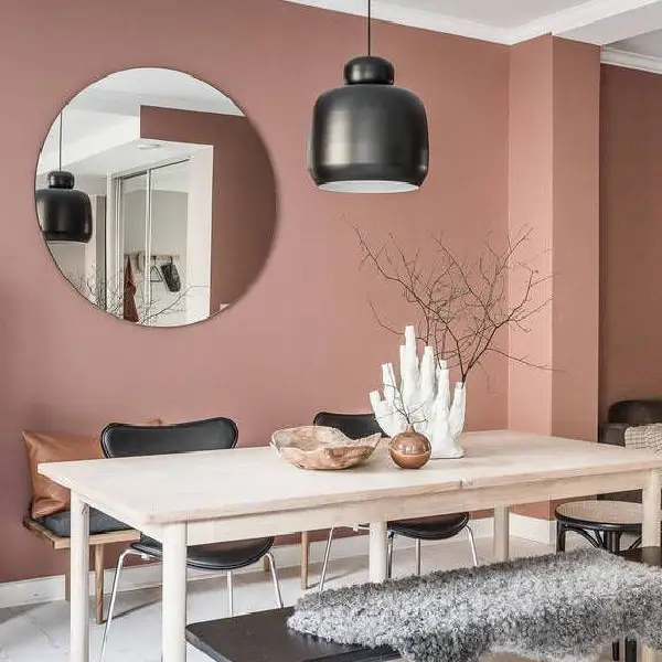
image sourced from here
Because blush has a nude tone and is a soft pink-peach color that is both warm and classic, designers adore it. Blush is a hue that works well on walls, floors, fabrics, and dinnerware.
Soft Lavender
Since soft lavender is a tranquil and soothing hue that may help create a relaxing ambiance for meals, it is frequently used in dining rooms.
image sourced from here
It may also give the area a hint of class and elegance. Lavender is a fantastic option for a dining room because it also has a reputation for enhancing appetites.
Misty Blue
It's a really calming tone because it's the color of the sky and the water. Selecting a misty blue color for your interiors is a wonderful way to bring in the outdoors and create a calm, Zen-like atmosphere.
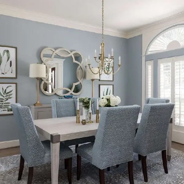
image sourced from here
Bold Accent Walls
Choose a color for your little dining room that contrasts with the other walls and furniture items to make it stand out.
Vibrant, bold colors may draw attention to themselves and give the impression that tiny areas are larger than they actually are.
Deep Burgundy Accent
Rich, opulent colors like deep burgundy can give any dining space a dash of refinement and drama. It is a color that works well with a wide range of hues and fashions, from conventional to contemporary.
image sourced from here
Navy Blue Accent
Accent walls in navy blue look fantastic in houses with a homey, antique aesthetic.
image sourced from here
The classic hue ensures that any gorgeous vintage objects may still be the center of attention in your room since it sets a mood without being overpowering and goes well with both 1910s and 2010s designs.
FAQ
What is the best color for a dining room?
Soft gray, classic white, navy blue, deep burgundy, sage green, gray, and blush pink are some of the best dining room paint colors.
What color should not be used in dining spaces?
Steer clear of neutral hues with a blue foundation or those with a chilly undertone. Avoid looking all white. Additionally, you might lose the classy effect you're going for by painting your walls overly colorful.
What type of paint is best for dining room walls?
Eggshell works well in lived-in areas like dining rooms and living rooms, where spills and dampness are not as common as in kitchens and bathrooms. Since eggshell doesn't reflect or absorb light, it typically has the most accurate hue.
What is the best color for a small dining room?
Choose traditional white, soft beige, and adaptable gray tones when furnishing a little dining area. Make use of lightweight storage and understated furnishings to avoid taking up important floor space.
Conclusion
Choosing the best dining room paint color may be hard work to do, but not if you know each color is suited for what space.
In this article, we have mentioned the most popular timeless dining room paints you can consider for your house.


- In this post:
- Elegant Neutrals
- Traditional Whites
- Timeless Blues
- Rich Earth Tones
- Classic Greens
- Timeless Greige
- Muted Pastels
- Bold Accent Walls
- FAQ
- Conclusion