How Do Modern House Paint Colors Transform Curb Appeal?

Elevate your home's curb appeal with the impactful choice of Modern House Paint Colors. The right palette transforms your exterior, offering a vibe of contemporary sophistication or risking an outdated impression. Navigating the spectrum of colors, finishes, and combinations can be daunting, yet crucial for striking the perfect balance of style and allure. In this exploration, we delve into the art of selecting hues that complement and add depth to your home's exterior. Discover the power of color theory as we unveil how modern paint choices can evoke emotions, shaping the overall ambiance of your living space. Join us on a journey to reimagine your home's exterior aesthetics.
The Psychology of Colors in Emotion
Exploring color psychology delves into the fascinating realm of how widely embraced colors shape human behavior. Each color carries unique meanings, connotations, and psychological effects, and these interpretations can differ significantly across diverse cultures. Beyond cultural nuances, individual preferences become a crucial player in molding color psychology.
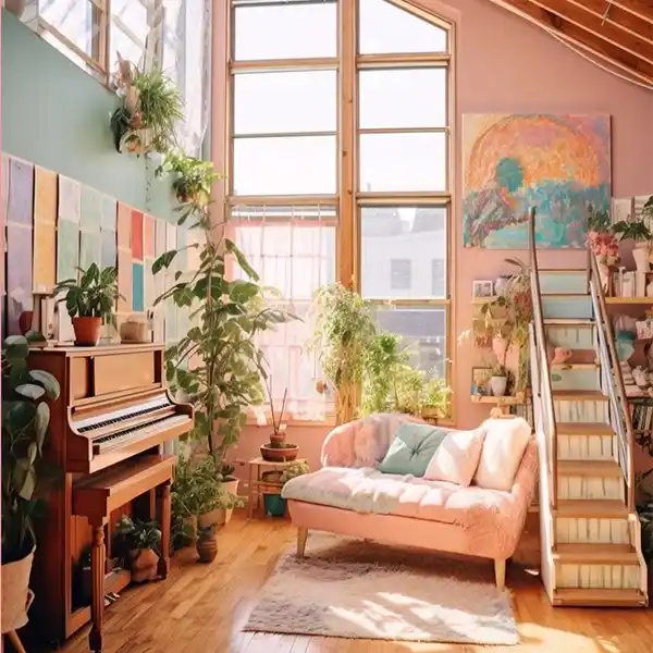
image sourced from here
At the heart of color psychology lies the application of color theory—an artful practice that involves seamlessly blending and pairing various hues. This practical approach aims to unravel intriguing concepts such as color perception and the profound impact that different color combinations can have on our psychological experiences.
The Impact of Modern House Paint Colors on Your Mood
Exploring the influence of color on mood unravels a fascinating interplay of associations within the human mind. Warm colors like red, orange, and yellow evoke emotions, from passion and comfort to anger and power. Conversely, cool colors such as blue, green, and purple create a calming atmosphere, countering anxiety and potentially triggering feelings of sadness.
Examples of Modern Colors and Their Mood Narratives
1. Blue
This versatile hue ranges from serene to distant, with dark shades conveying loneliness and detachment. Light blues induce calmness and signal dependability, often used in healthcare settings and marketing to establish trust.
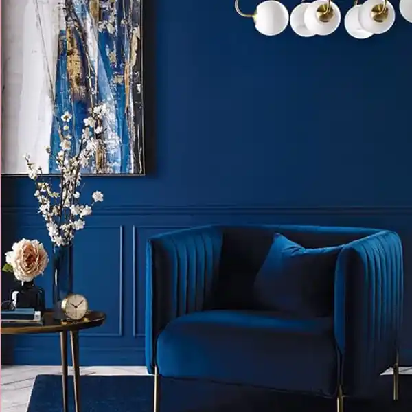
image sourced from here
2. Green
Associated with nature, green generates tranquility and rejuvenation. Embracing various earthy tones, green accents can create a calming and uplifting atmosphere. However, it may symbolize jealousy in specific contexts.
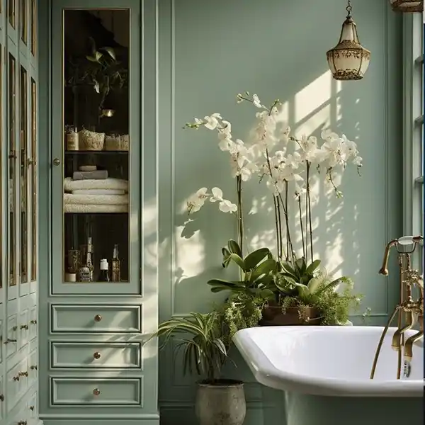
image sourced from here
3. Purple
Historically linked to royalty, purple signifies authority and wealth. It also sparks creativity and inspiration, especially in pastel shades like lavender, known for their calming properties.
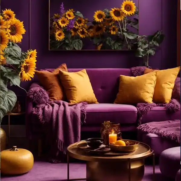
image sourced from here
4. Red
Red is a color of intense emotions connected to love, passion, anger, and danger. It stimulates the body, increasing heart rate and energy levels. In color therapy, red aids in releasing negative emotions.
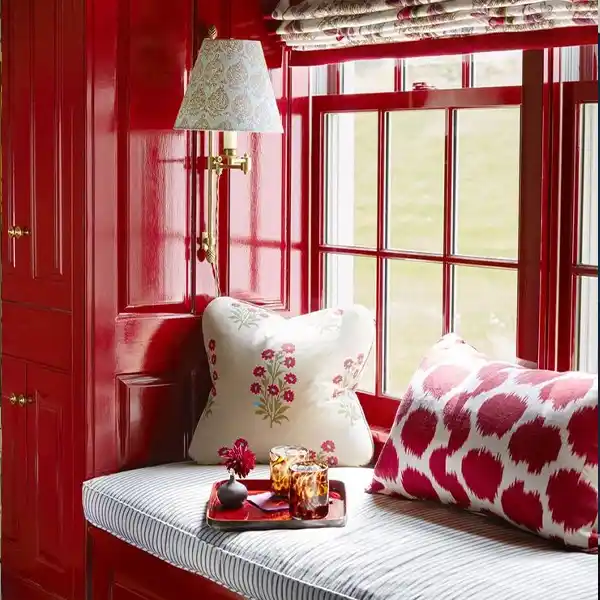
image sourced from here
5. Yellow
An energizing color, yellow, provokes happiness and optimism. While its brightness is cheery, excessive saturation may cause eyestrain and frustration.
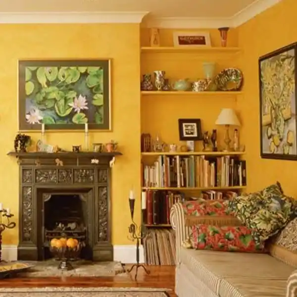
image sourced from here
6. Brown
Brown establishes a sense of stability and comfort, bringing warmth and friendliness to home spaces. It exudes practicality and dependability, offering a touch of vintage or well-established charm.
image sourced from here
7. White
The predominant use of white in design creates a minimalist aesthetic, evoking a sense of freshness and comforting simplicity in home interiors. White provides an innocent backdrop that symbolizes peacefulness, although an excessive application may risk feeling cold and overly sanitized.
image sourced from here
8. Gray
Gray, a mature and neutral color, offers a sophisticated touch to home decor. Serving as a lighter alternative to black, it presents a subdued and reliable palette. However, the nuanced nature of gray means it can be perceived as indecisive or conventional, introducing a layer of subtlety to home color narratives.
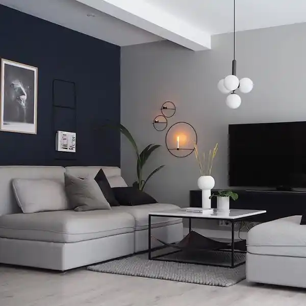
image sourced from here
9. Black
Black, synonymous with power, luxury, and elegance, effortlessly brings sophistication to home spaces. Beyond its professional and neutral aura, black embodies simplicity, making it versatile for various home decor styles. However, it's crucial to note that in specific contexts and cultures, black can carry connotations of mourning or sadness, introducing nuanced emotions to its role in home aesthetics.
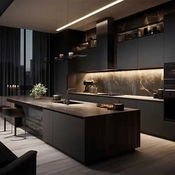
image sourced from here
15 Best Modern Exterior House Color Ideas
- Hunter Green, Muted Sage, and White
This home's charm would fade into darkness without the subtle touch of lighter greens on the gable and door. A hint of color, bordered by white trim, transforms the somber exterior into an inviting haven. The chalky matte finish on the green paint cleverly blends non-neutral tones. Opting for a hunter-green picket fence, unconventional from the usual white, ensures all eyes are on the sage green door.
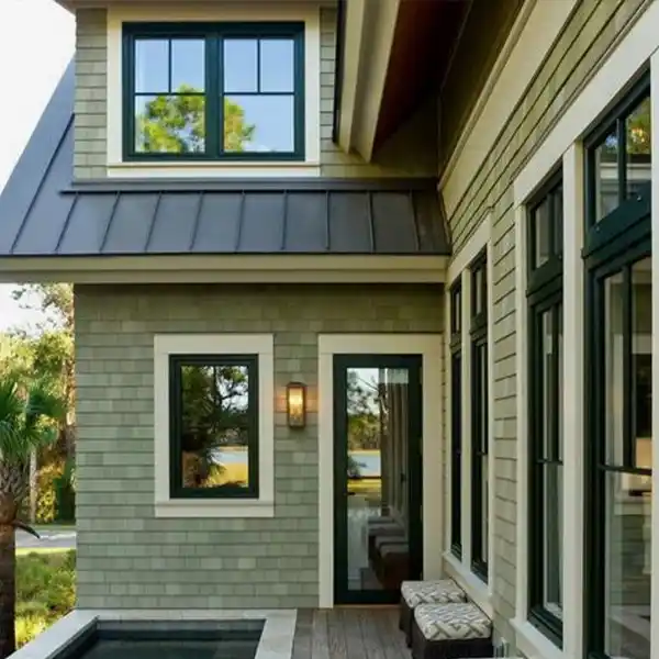
image sourced from here
- Soft Lime, Powder Blue, and White
Create a whimsical streetscape with pastel exterior tones. This bungalow's muted lime-green facade harmonizes with its natural surroundings. The playful powder blue on the front steps and door lures guests inside. To steer clear of an overly vibrant look, choose less intense shades of bright colors and balance them with ample white trim.
- Red, White, Blue, and Beige
The Tudor-style cottage welcomes a vibrant red front door, complemented by white window trim that adds depth to the beige facade. The choice of light blue, rather than navy, prevents a Fourth of July decor vibe.
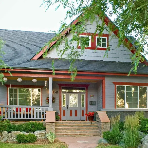
image sourced from here
- Pearl Gray, Slate Blue, and White
Inspired by nearby stone and concrete, this home emerges gracefully. The serene palette accentuates its best features, establishes symmetry, and reinterprets midcentury modern style. Placing slate blue at the front entry and extensive bright white crafts a haven with a sleek silhouette.
image sourced from here
- Black, White, and Aqua
Combine black siding with crisp white trim to showcase your home's architectural details and avoid a gloomy atmosphere from the dark neutral. Introducing an aqua front door brings an additional touch of vibrancy, creating a striking contrast with the deep black siding and the sleek black metal roof.
image sourced from here
- Lavender, White, and Purple
Bring a touch of surprise to your home's exterior by incorporating lavender, especially with a vibrant door. Opt for a pastel shade of lavender with cool gray undertones to maintain a modern feel and a more subdued look.
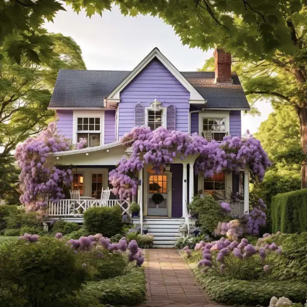
image sourced from here
- Warm Gray, Red, and Black
For smaller or traditional-style homes, simplicity is critical in exterior color combinations. Use neutral siding colors like warm gray as a solid base and add pops of color strategically, like a glossy red front door. Adding black through shutters and a mailbox, set against white trim, creates a clean and modern aesthetic without overwhelming the color scheme.
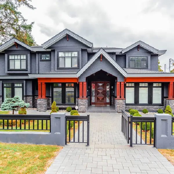
image sourced from here
- Forest Green, White, and Lime
Take inspiration from the brick facade, choosing forest green for the siding to complement the brick's tones. White trim adds brightness, while a bold lime-green door injects a modern twist into the traditional home.
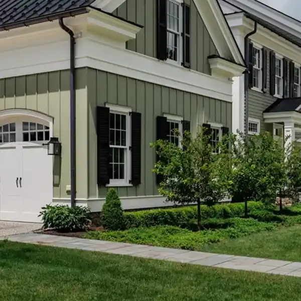
image sourced from here
- Cocoa, Olive, Off-White, and Russet
Anchor your home with cocoa brown siding, complemented by dark olive brick steps and foundation. Lighten the look with moss-green window sashes accented by off-white trim. The russet-colored door, with orange undertones, stands out against the brown siding, creating an entrance that harmonizes with nature through a mix of light and dark neutrals.
- Iron Gray, Arctic White
Revitalize your home with a burst of enduring color by selecting a fresh siding hue. Thanks to technological advances, modern options resist chipping and fading, ensuring vibrant shades that demand less maintenance and maintain their appeal over the long term.
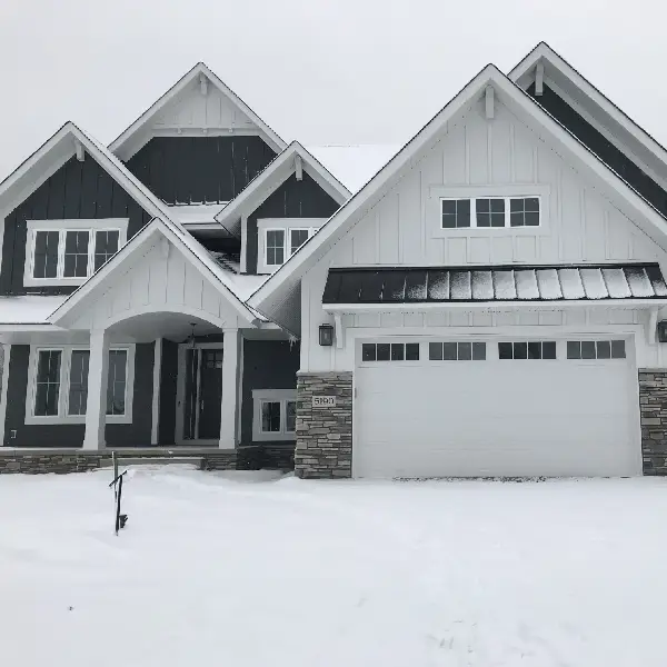
image sourced from here
- Red Brick, Navy Blue, White
Embrace the timeless allure of the red and blue exterior blend, a classic combination that stands the test of seasons. The home's rich red brick exterior exudes tradition, with deep navy blue shutters harmonizing tastefully with the front door and framing windows.
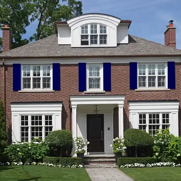
image sourced from here
- Salmon, Jade, Rusty Brown
The exterior's textured surface gives the salmon paint a weathered appearance, casting varying dark and light shades that complement the old-world architecture. Bold jade green shutters add jewel-tone richness to the refined facade. At the same time, rusty brown window trim and a front door harmonize with the salmon, sharing complementary orange undertones for a cohesive look.
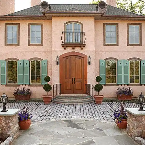
image sourced from here
- Chocolate, Chartreuse, Sand
Explore the unexpected by pairing natural green and brown tones with a twist of chartreuse, adding a lively contrast. The vibrant trim creates a dynamic counterpoint against rustic stone walls and earthy siding, connecting the home seamlessly to similarly hued garden plantings. When seeking exterior paint ideas, draw inspiration from unalterable features like roofing, stonework, and landscape to guide your color choices.
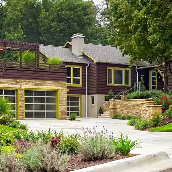
image sourced from here
- White, Black, Gray
Achieve standout elegance for your home without juggling multiple paint colors. The farmhouse boasts a clean and crisp aura with white trim, siding, and railings. Taking cues from the metal roof, a black gable vent and charcoal gray steps add depth. The interplay of dark finishes and white surfaces enhances the historic country charm and complements the river rock foundation.
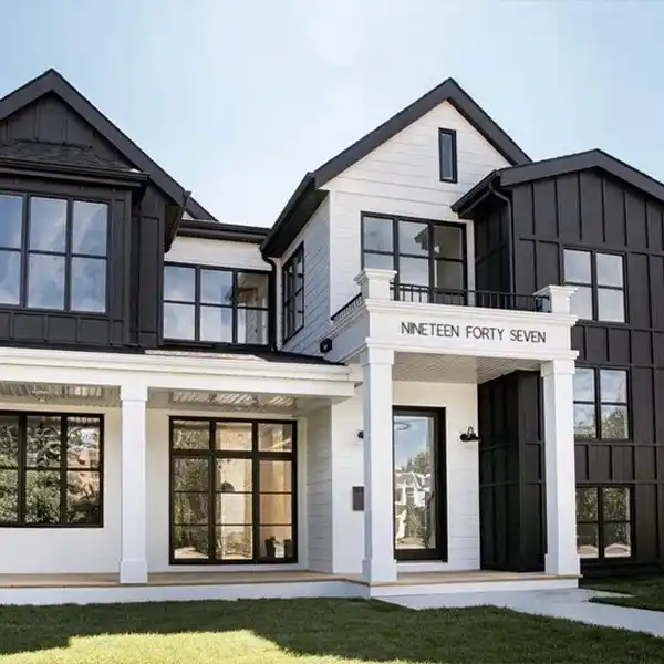
image sourced from here
- Pine Green, Red-Brown, White
Craftsman-style homes find harmony in field and forest hues. Forest green shutters against a rusty brown exterior strike a perfect balance. White paint brightens the porch walls and columns, emerging from the roof's shadow, skillfully accentuating the green shutters and a front door stained to harmonize with the siding.
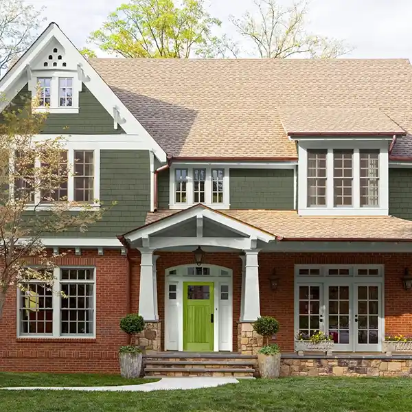
image sourced from here
Selecting the Perfect Color Palette for Your Home- Tips and Tricks
Creating a unified color scheme for your modern home need not be overwhelming. So, how do you settle on a paint palette that ensures a seamless flow? Here are some user-friendly tips to consider for color continuity in your home.
- Size Matters: Consider the style and size of your home. A large, modern home with an open concept may call for different color choices compared to an older, more traditionally designed space.
- Define Your Style: Before delving into colors, envision the atmosphere you want in your home. Are you drawn to cool, calming hues or warm, energizing tones? Whether you prefer vibrant pops of color or gravitate towards neutrals, understanding your style preferences is a crucial step toward finding a cohesive color palette.
- Start with the Core: If unsure where to begin, focus on the most significant central room—often the kitchen or living room. Let the color you choose for this space set the tone for the interior paint scheme.
- Spatial Awareness: Take note of which rooms are visible from one another. Ensuring color flow between connected spaces is essential. A home walk-through and a floor plan sketch can help you stay organized if you struggle to keep track.
- Undertones Matter: Streamline your paint options by selecting the same undertone for adjacent spaces. For instance, if one room has a beige with a subtle green undertone, choosing a blue-gray for the neighboring room with a hint of green maintains a harmonious connection.
- Consider Connective Spaces: Hallways, entryways, and landings play a pivotal role in a unified color palette. Opt for neutral tones, paying attention to undertones, in these connecting areas to provide visual breaks between more vibrant sections of your home.
- Simplify with Shades: Reduce the stress of choosing a palette by sticking to different shades of the same color. Designers often recommend selecting a color strip with light, medium, and dark shades from the same family for a hassle-free choice that adds depth and interest to your home.
- Consistent Neutrals: Maintain flow and harmony by keeping ceilings and woodwork in the same neutral color throughout your home. This consistency provides a cohesive backdrop for your chosen color palette.
Elevate your home's curb appeal with the impactful choice of Modern House Paint Colors, redefining aesthetics and reflecting personal style. Understanding the psychology of colors, we've explored how nuanced selections influence emotions and moods, evident in examples from unexpected greens and browns to timeless reds and blues. Our user-friendly tips for selecting the perfect color palette empower you to make informed choices based on size considerations, style definition, and undertones.
As you delve into the art of color selection, remember: your home is a canvas, and Modern House Paint Colors offer the palette to paint the story of your lifestyle. In modern home aesthetics, embrace the possibilities waiting to be explored. Your home is a living, breathing entity that adapts to your lifestyle.
Let the transformative magic of Modern House Paint Colors turn your dwelling into a haven that feels uniquely yours. Whether you choose calming neutrals or adventurous pops of color, your home is a canvas awaiting your personal touch. Embark on this colorful journey with confidence, and let your choices tell a story of your individuality.
FAQs
Why is establishing a cohesive color scheme crucial for a home?
Creating a cohesive color scheme is essential for fostering harmony and balance within your living space, transforming it into a unified and inviting environment that promotes a calming atmosphere.
How should a color palette be chosen for a home?
Begin the selection process by finding inspiration, such as artwork or a rug, and derive the palette from the colors present. Utilize color theory principles to guide the choices, ensuring a harmonious and well-coordinated scheme.
Is it necessary to maintain the same color throughout the entire home?
While uniformity is not mandatory, maintaining a cohesive color scheme is vital. This can be achieved by opting for similar shades or tones across spaces or selecting colors that complement each other.
Can numerous colors be incorporated into the color scheme?
Avoid using too many colors to prevent a chaotic and overwhelming look. Stick to a few key colors and use accents strategically for vibrant pops within the overall scheme.
How can trends be integrated into the color scheme?
Please select one or two trendy colors and incorporate them as accents in your space. This allows for updates without a complete overhaul whenever a new trend emerges.
What if a change of mind occurs regarding the color scheme?
It's perfectly acceptable to alter the color scheme. Colors can be easily adjusted with paint or accessories. Embrace experimentation to find what resonates best without fear of changing preferences.


- In this post:
- The Psychology of Colors in Emotion
- Examples of Modern Colors and Their Mood Narratives
- 15 Best Modern Exterior House Color Ideas
- Selecting the Perfect Color Palette for Your Home- Tips and Tricks
- FAQs